So you have all been poking us for another status update for a while now, but several cool things just aren’t quite ready to show off yet. Instead, we’re going to try something different this time.
2.2 contains a lot of interface improvements over 2.1, with changes to everything from the menu UI to the way the game displays your character. Many of these changes are intended to help newer players learn how to play our game, which has a notoriously bad learning curve because parts of SRB2’s design conflict directly with the way modern Sonic behaves. We want the challenges in SRB2 to be intentional, not the unintended consequences of designing for an audience we know too well. However, there are also plenty of quality of life improvements for experienced players. While we know you may not find this as cool as new levels, we hope something here sparks your interest.
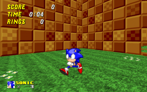 | We’ll start with the biggest change: this is not analog mode. With 2.2, your character will face whatever direction you press by default. You finally get to see all the other sprites for the characters instead of constantly staring at Sonic’s butt the whole game. This change is purely visual, and moves like the thok and glide still go in the direction your camera is facing, not your character. In ringslinger modes this feature is disabled, and it’s also possible to disable it in the options should you prefer the old behavior, but we highly recommend giving it a shot. |
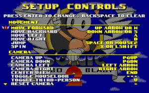 | To go along with that change, the control settings have also been changed significantly. You’ll notice the words “strafe” and “look” are gone entirely, replaced by the words “move” and “camera”. We’ve discovered a lot of new players try to play the game without using all of the movement controls, and therefore have a frustrating experience. We hope that by renaming the controls it makes the necessity of all the controls more obvious. Also, this menu is now a scrolling, categorized list, which puts all of the important controls at the top for easy readability. |
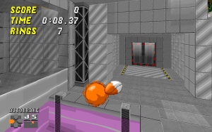 | Our attempts to teach new players the controls don’t stop there. This is a screenshot of a record attack replay being viewed, which shows the controls being used in a new HUD element in the bottom-left corner, as well as an icon for a new feature: automatic braking. One of the parts of SRB2 that new players generally don’t understand is the requirement to press the direction opposite of your momentum to skid to a stop, like the classic games. Automatic braking, which is on by default, behaves like the opposite direction is automatically “pressed” when the movement controls are released. While most veteran players will want to turn this off, this allows new players to more immediately have fun as they aren’t flying off into the wild blue yonder the instant they thok. |
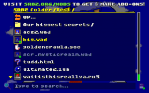 | Another issue a lot of new players have had over the years is questions involving how to use addons in SRB2, as currently it requires the use of the console or command line. 2.2 features a brand new in-game addon browser, allowing you to simply select what addons you want to run and enable them. It also features a search field to allow you to type the partial name of what you’re looking for in the folder to find stuff quickly in a cluttered directory. Obviously, the console and command line methods still work, but if nothing else this should help for that situation when you’ve forgotten the filename of that one file with too many underscores. |
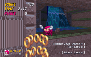 | We’ve also implemented some accessibility features to try to aid those who have trouble with our heavy use of color and audio cues. We’ve implemented a closed-captioning system for the hearing-impaired, which can also be useful for providing “sound” in silent GIF recordings. We’ve also developed an in-game tool to adjust the base palette at runtime to help add contrast for colorblind players. This screenshot has the palette tweaked for red-green colorblindness and has the captioning enabled. |
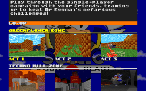
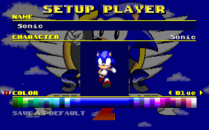
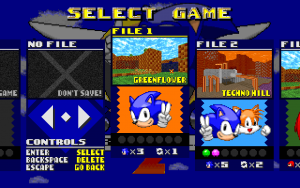 | Finally, all the menus were given a check for ease of understanding, rearranging and improving them across the entire game. Here are the current versions of the save select, level select, and multiplayer player setup menus. We’ve tried to improve the visuals for each menu as well as use scrolling and categories where applicable to make the menus as readable and easy to use as we can. |
 |  |
